Looking Forward, and Fonts
from Tuesday, June19th of the year2007.
This upcoming weekend marks the dual premieres of two very different works, for two very different ensembles. On Friday night, the Brooklyn Youth Chorus is premiering a new piece I wrote for them, called Syllables. Then, on Saturday night, the Boston Pops are premiering a piece called Wish You Were Here. More information about the specific concerts is available by looking to the right of this post and a touch down, in a handsome pea-soup green box. I will add here that for those of you looking to get information on the Pops/BSO website, GOOD LUCK, their ass might have Jimmy and a lot of money but their website leaves a bit, as you will see, to be desired. I do like the pictures of Tanglewood, though. I included the link to the Metropolitan Opera‘s site because that is an example of a performing arts organization who has really figured out its web presence as well as the way that presence can inform its print design. Let’s go deep, shall we?
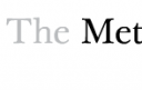 Their new logo is just the text “The Metropolitan Opera“, on their website in a handsome Georgia-like font, but, functionally, it’s the bold and un-bold that makes it distinct. It relates, also, to how people refer to it (“I’m totally going to the Met tonight to see Tosca“).
  If you click around their website more, or, better yet, go see an opera, you will see how comprehensive the redesign has been; even the stage door entrance bears the traces. Compare that, for a minute, to the New York Philharmonic‘s ugly new font and rebranding. Look at how close the o is to the Y in “York” ““Â like Creepy Frottage Guy in the subway, right? The logo itself reminds me of Stazione Termini in Rome…and what are they thinking with those two swatches of fabric flowing in the background? Behold:
 What’s alarming about it is that I cannot imagine a bunch of educated design professionals sitting around and coming up with a logo that looks like it would be at home in an airport or a bank.
  I went just now to a bunch of airport websites to see what their logos really looked like, and some of them are quite elegant indeed (and others not so much, but it’s interesting anyway to look around); check out this playful one, this gauzy, religious one.
  My favorite is Rome, where the visual experience of the website is mirrored by the utter chaos that awaits you when you land. (And, by the way, I sort of adore Stazione Termini). But really, La Honte, New York Phil. This, in combination with your eerie programming, is why I don’t feel like you are my Home Team. I want to love the Phil; I want to have a relationship with my hometown orchestra, but stuff like this makes it difficult to really feel like we are on the same page.
Writing this piece for the Pops was really fascinating, and I guess I shouldn’t say too much before we can actually figure out what this thing sounds like. I’m really excited! I mean, I have a pretty good idea, but what remains to be seen is how well it will come off after only one rehearsal. The emotional program of the work is complicated, but the score itself is pretty simple, and the parts had to be simple given the rehearsal situation.
More on this as it unfolds.
3 Comments
June 20th, 2007 at 9:27 am
While I agree with you that the kerning on the Philharmonic’s logo leaves a little (space) to be desired, I can’t sign off on bashing their website just because. The swatches of fabric in the background look great. They add a little playful dynamism to what is otherwise a boxy and staid — if well-proportioned — layout. Both sites go to Helvetica for text that really matters. If anything, I’d say it’s the Met’s logo that leaves me hanging. OK, I get it, it’s designed like how people say it. But that’s it? I mean I’m happy that the MBTA in Boston figured out sometime in the 70’s to change their logo into a big old T (because people refer to the trains as “the T”), but that doesn’t exactly make the design especially notable either.
June 20th, 2007 at 9:55 am
You are on a blogging rampage, this was a good one! Can’t wait to hear about how the Pops piece sounds, I wish I could be there…
June 21st, 2007 at 9:19 am
Delightful as always, Nico. I was anticipating, however, further elucidation of the connection between douche branding and the gauzy skeins flowing through the NY Philharmonic’s website, but I suppose in this case, the pictures speak for themselves…